

Case study Summary
An Ottawa-based dentistry practice
Case study Summary
Challenge
Case study Summary
Seller and Laframboise Dentistry was undergoing a significant transition due to a change in partnership with Dr. Brown stepping down and Dr. Laframboise joining the practice.
This change required a complete rebrand to reflect the new leadership while maintaining the trust and strong identity the practice had built over the years. Additionally, their social media presence had become dormant, and they needed to revitalize it to attract new patients and engage authentically with a broader audience.
Our Solution
Case study Summary
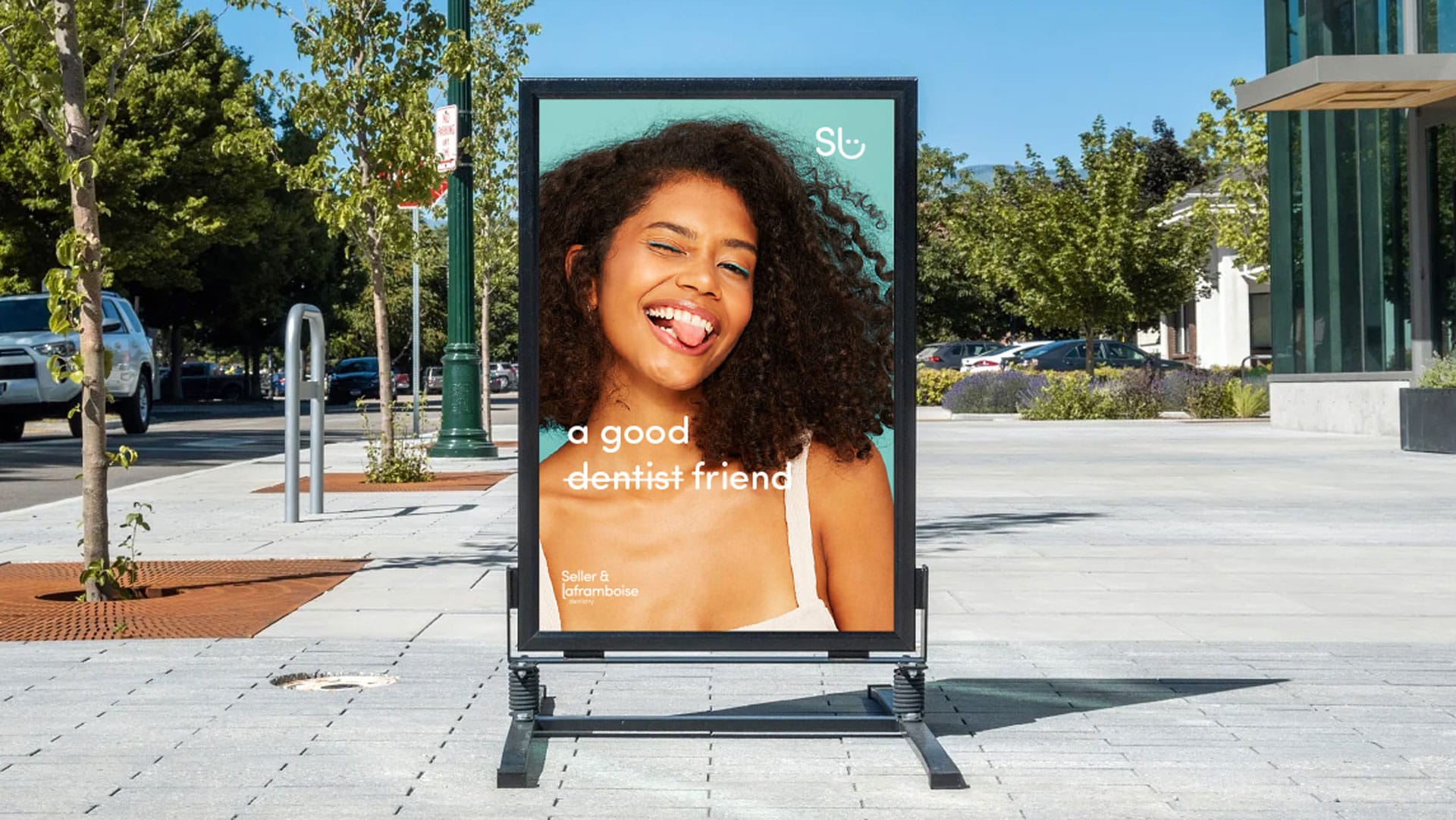
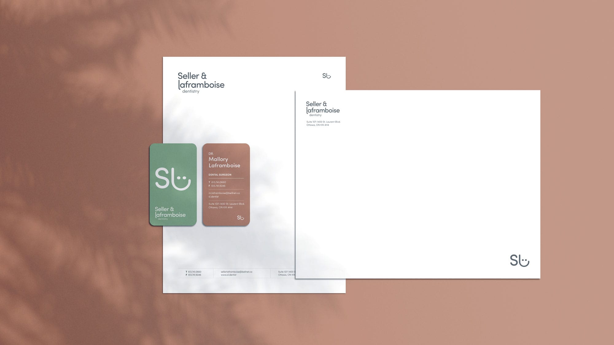
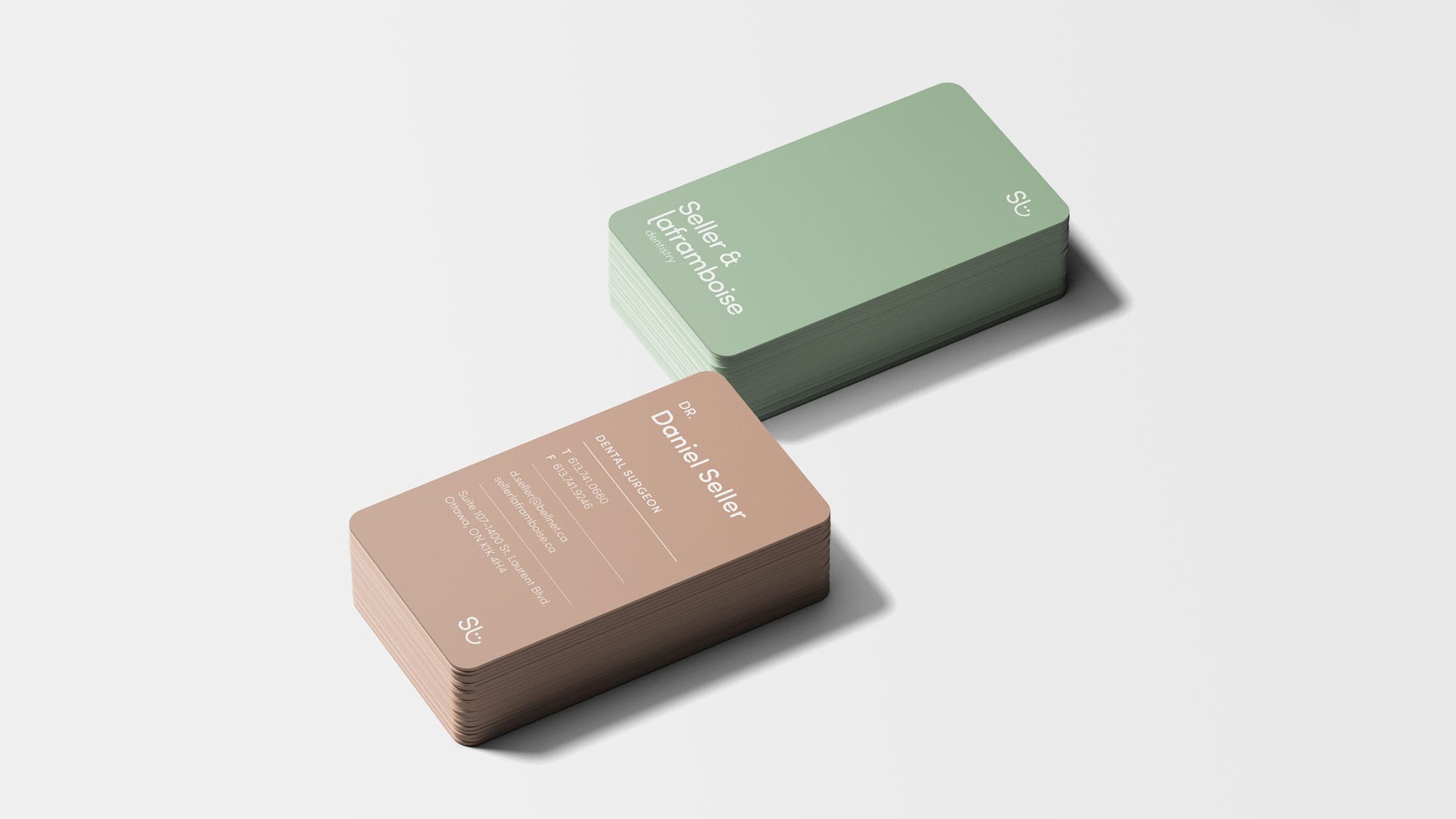
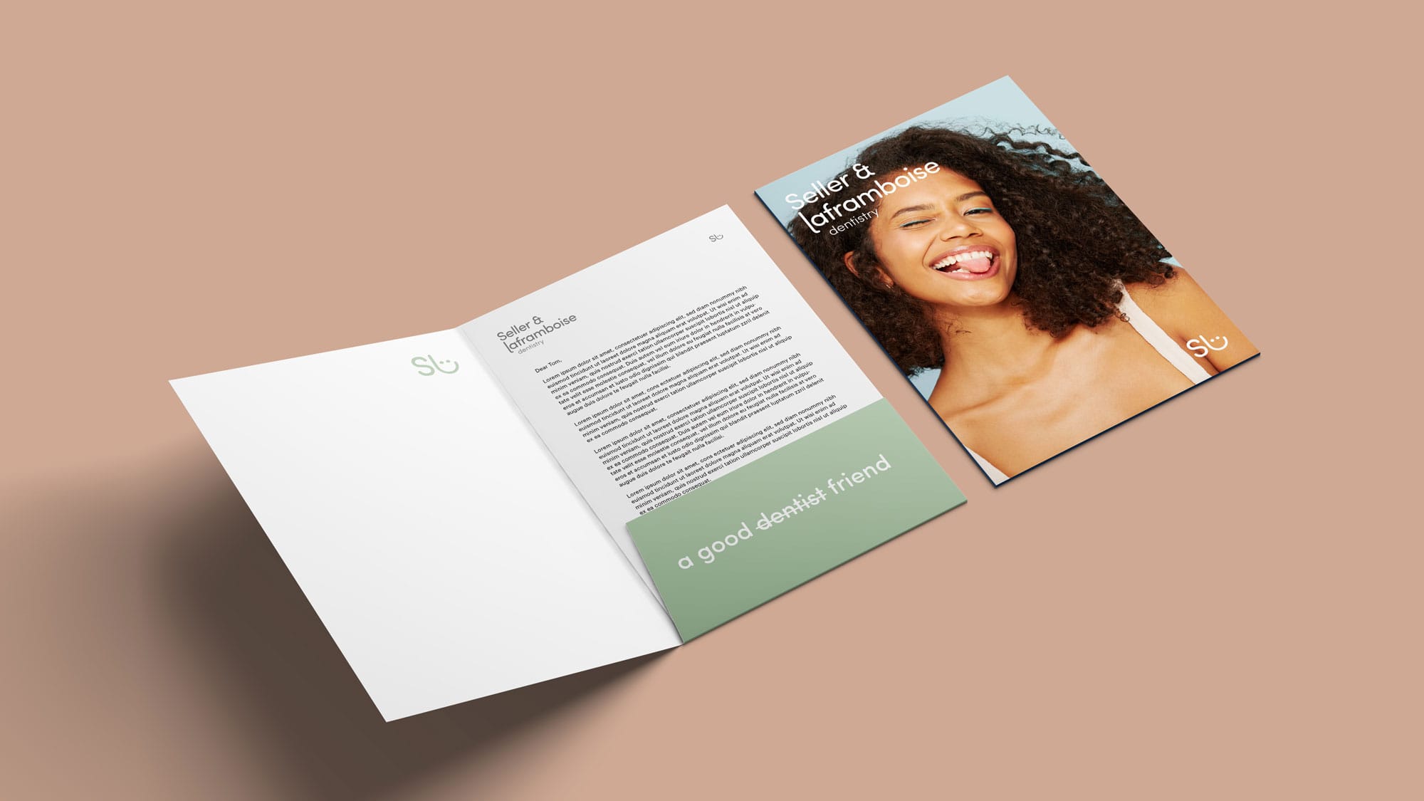
Our solution was anchored in creating a unique positioning that set Seller and Laframboise Dentistry apart from other dental practices in the National Capital Region.
We began by leveraging the practice’s true identity and the distinct personalities of the new leadership to create a refreshed and inviting brand. This included developing a custom typeface, a modern color palette, and new commercial photography that highlighted the warmth and personality of the staff. We also revitalized their social media strategy, focusing on real stories, engaging content, and personal milestones to create a genuine connection with their audience. The centerpiece of this transformation was a new website that integrated all these elements, offering a seamless, modern, and friendly online experience. The result was a distinct and authentic brand that stood out in the dental industry and resonated deeply with patients.
The challenge
Case study Summary
Lorem ipsum dolor sit amet, consectetur adipiscing elit, sed do eiusmod tempor incididunt ut labore et dolore magna.
The type-driven identity hints at the industrial past of Studio’s home in a former factory, as well as the creative spirit and resourcefulness of Studio as a theatrical company. The wordmark and primary typography are set in a non-stencil version of the utilitarian heavyweight font AType (designed by Pentagram partner Matt Willey); secondary type appears in the geometric sans Metric (from Klim Type Foundry) and the serif Publico (from Commercial Type). The primary brand palette is a striking yellow, black and white.
ABOUT THE CLIENT
Case study Summary