Challenge
Diving Canada originally approached us because their website was antiquated, and could no longer serve the evolving needs of the federation. After conducting our auditing process it became obvious that this workhorse of a federation was in need of something more than a website. They are an incredible federation that produces some of our nation’s top athletes and is host to some of the planet’s top diving events, but nobody knows…
Solution
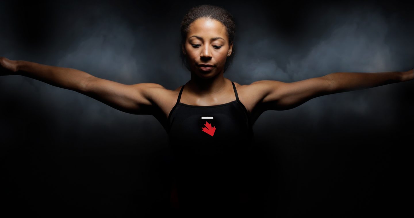
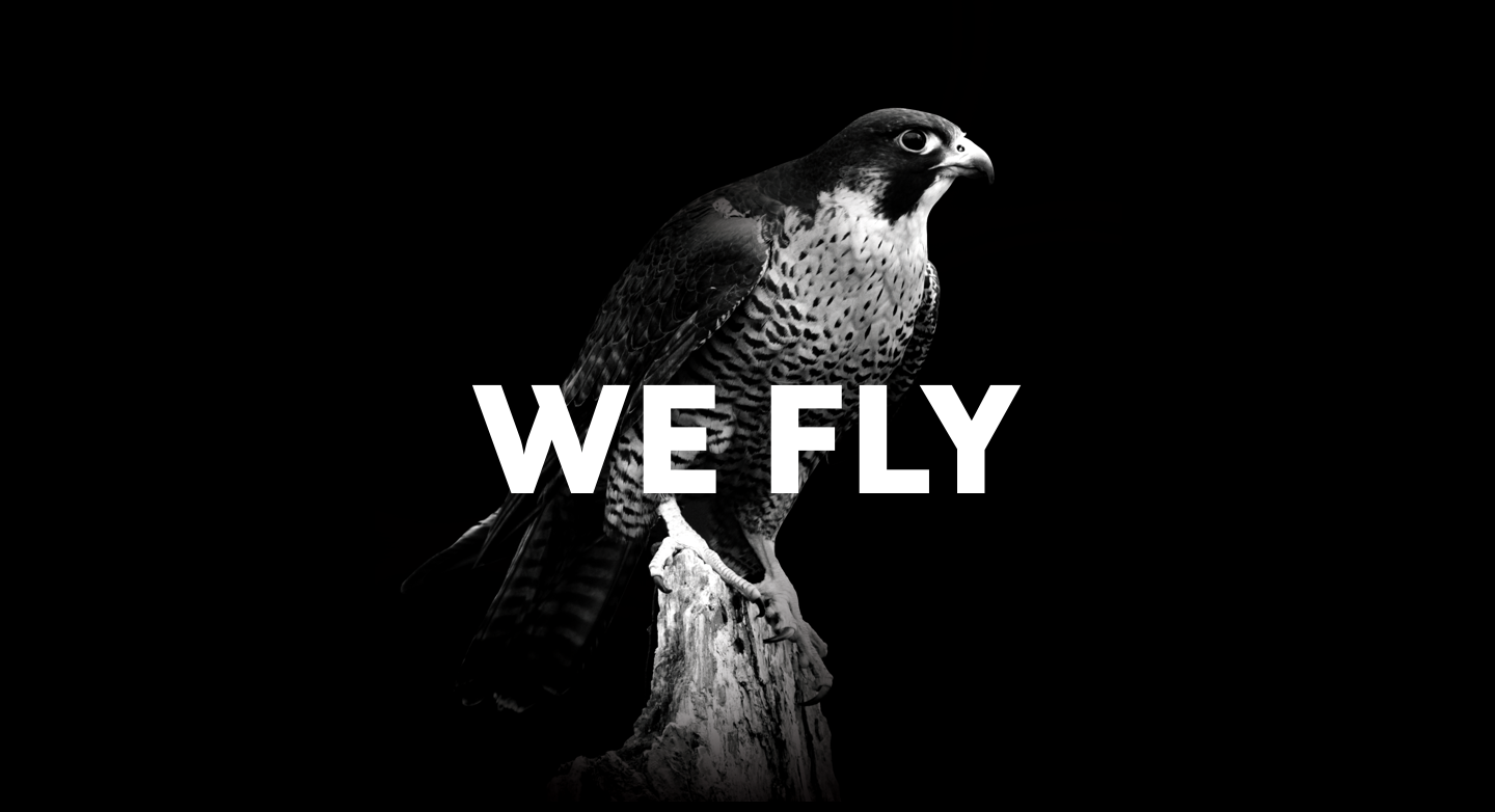
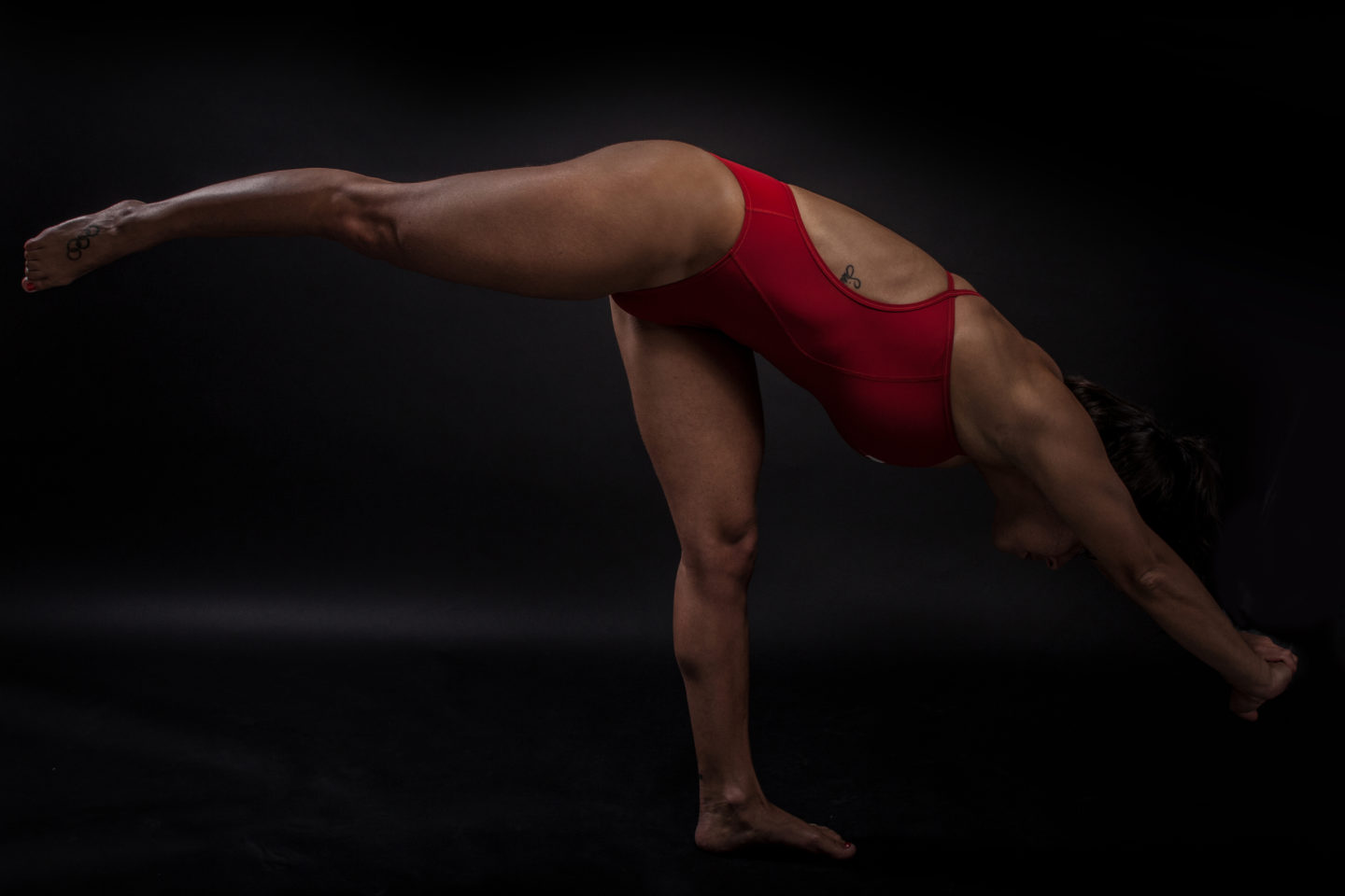
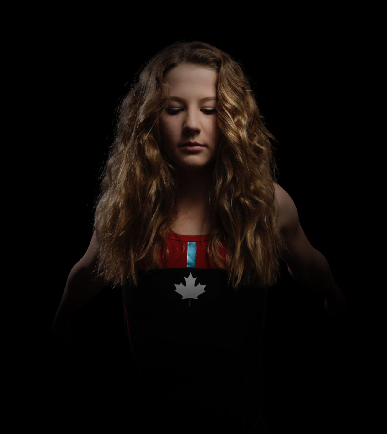
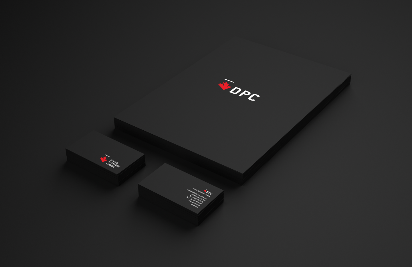
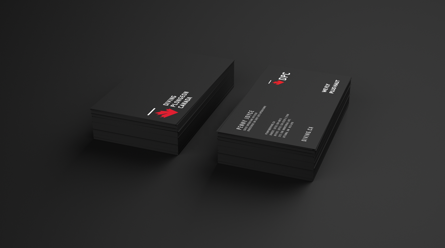
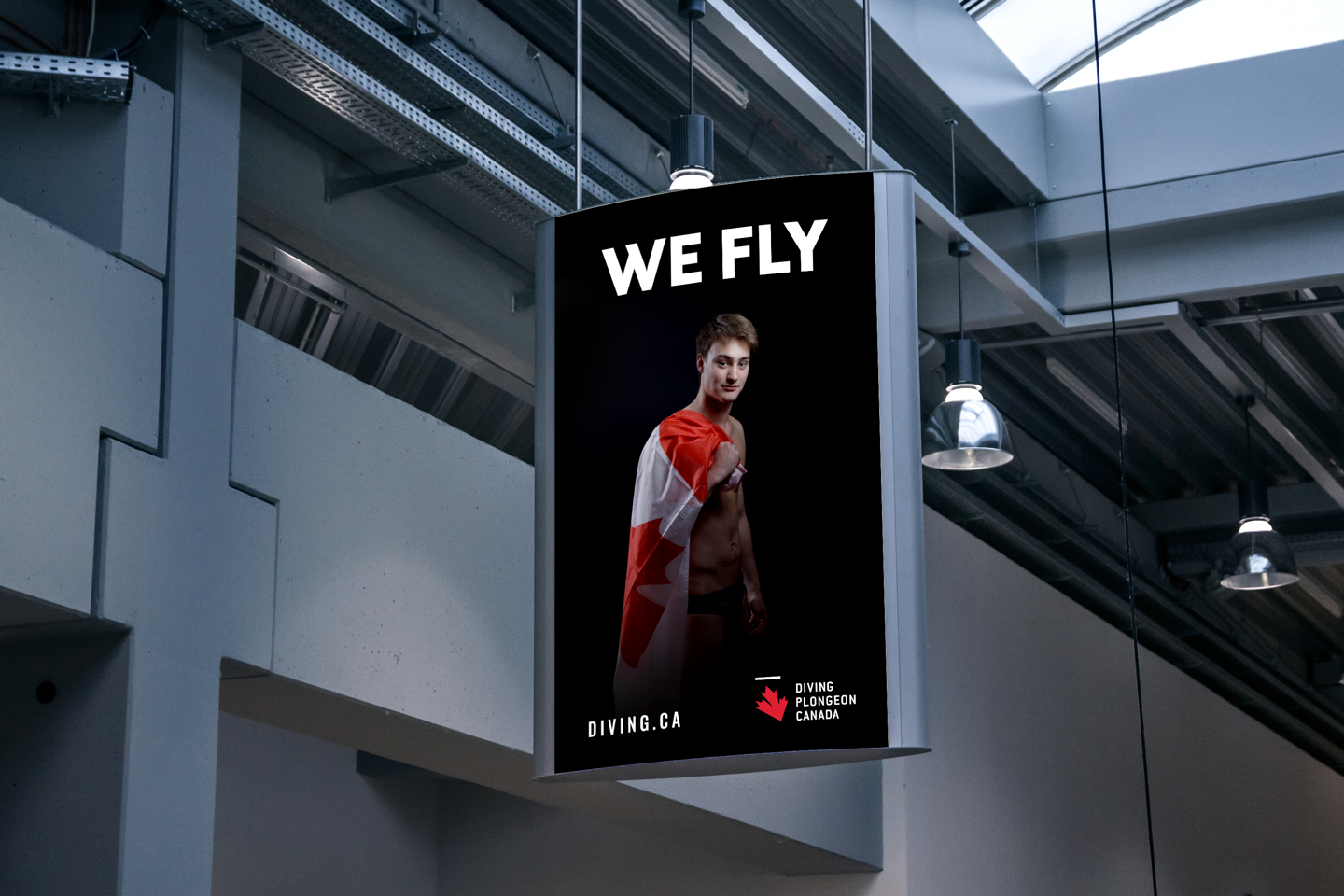
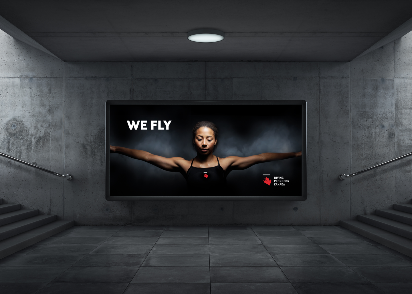
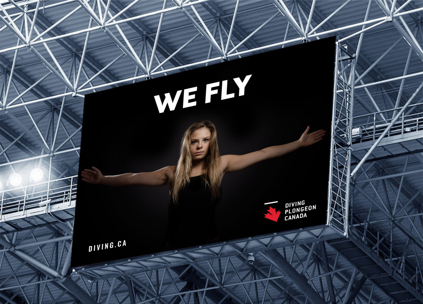
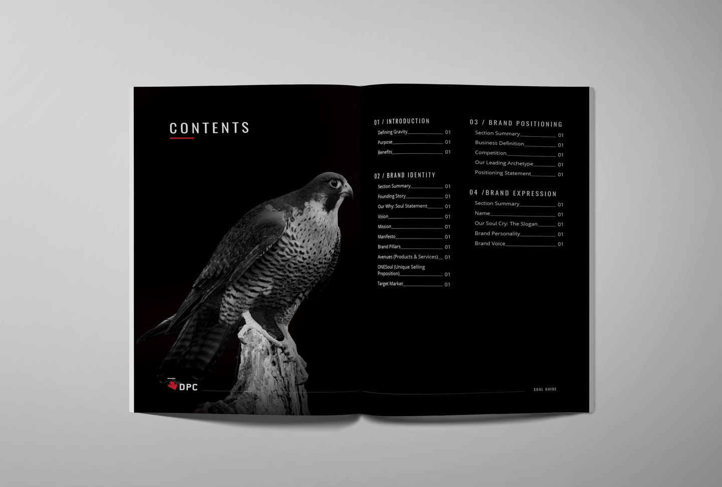
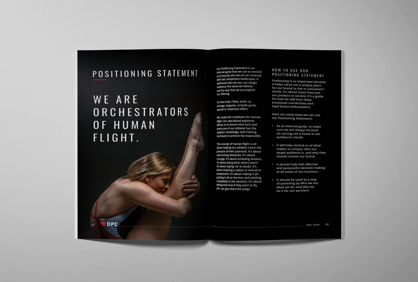
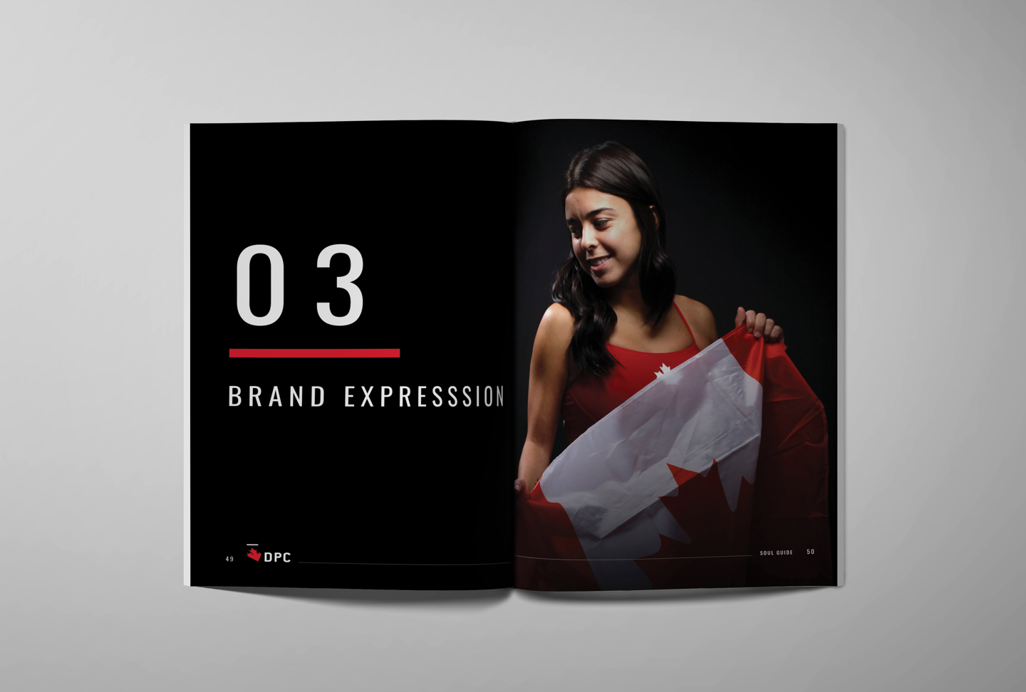
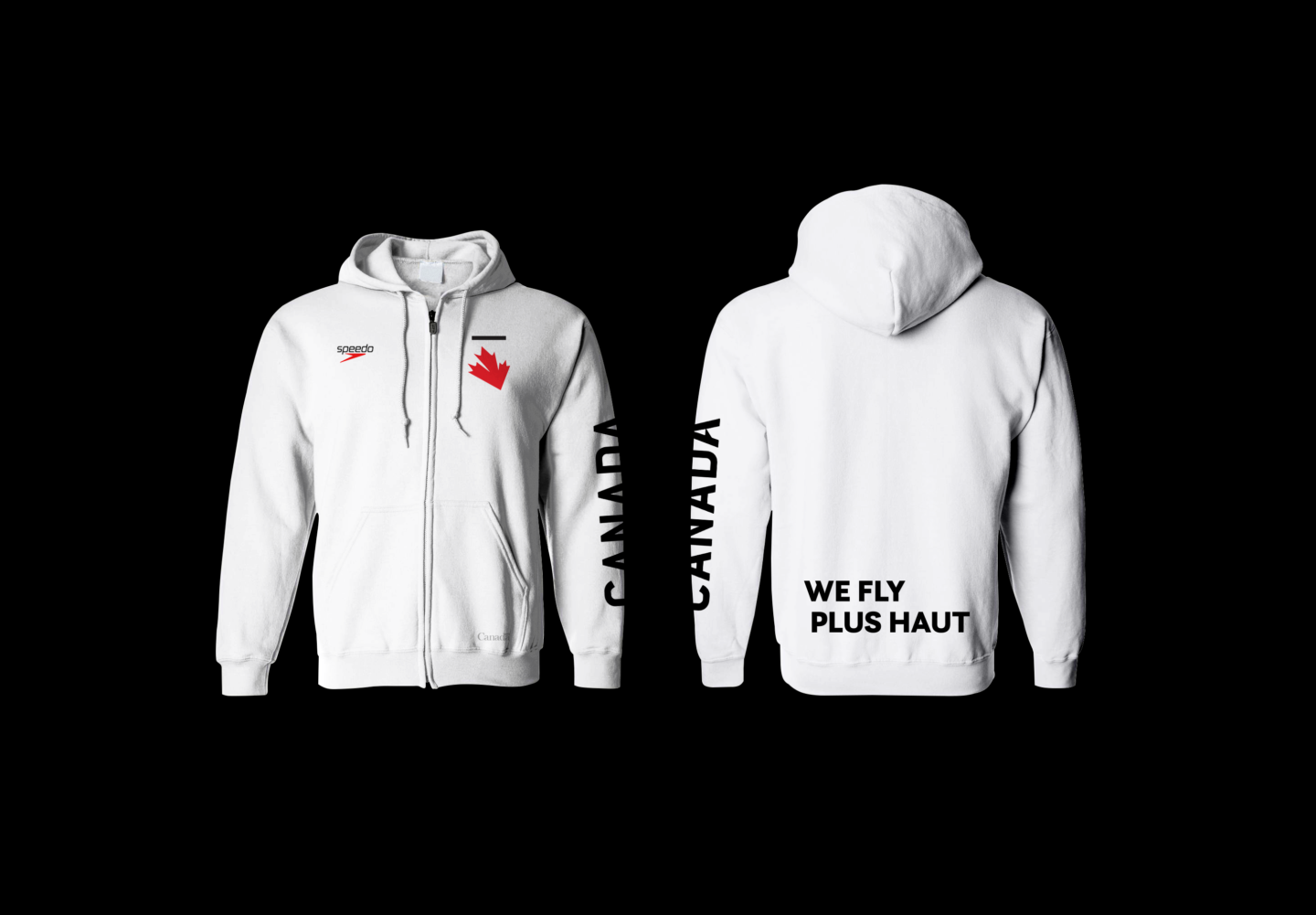
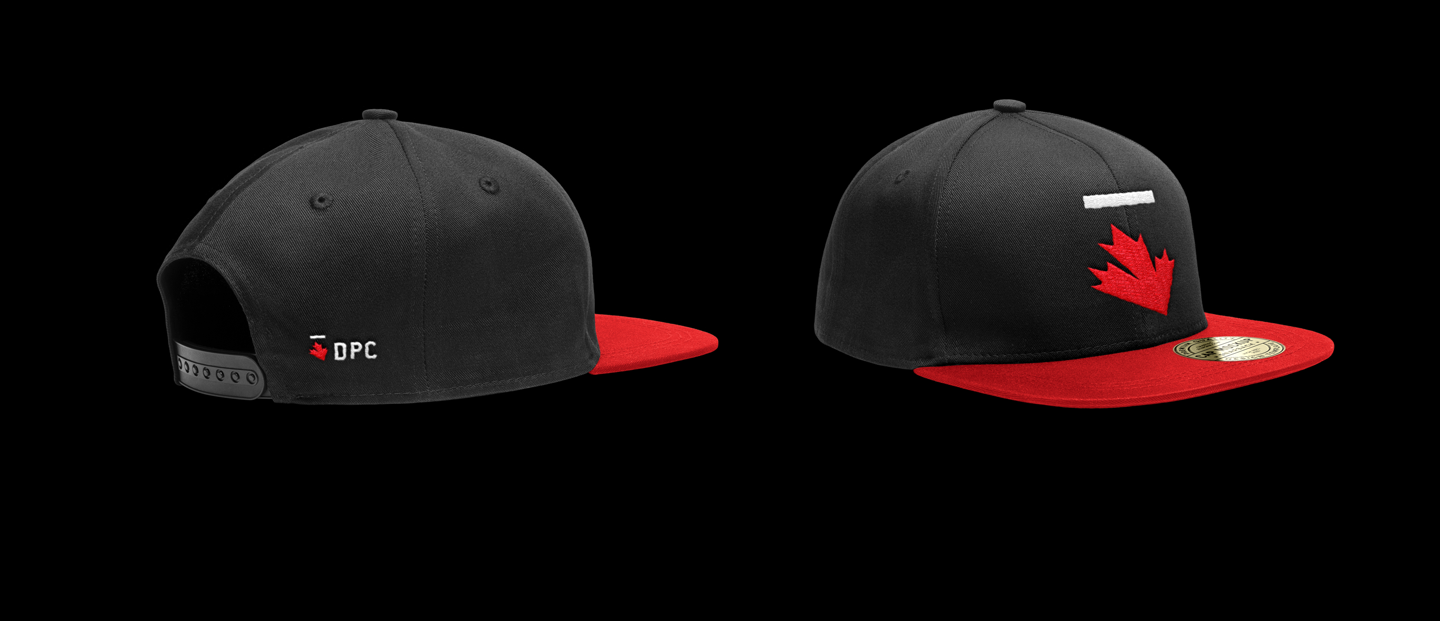
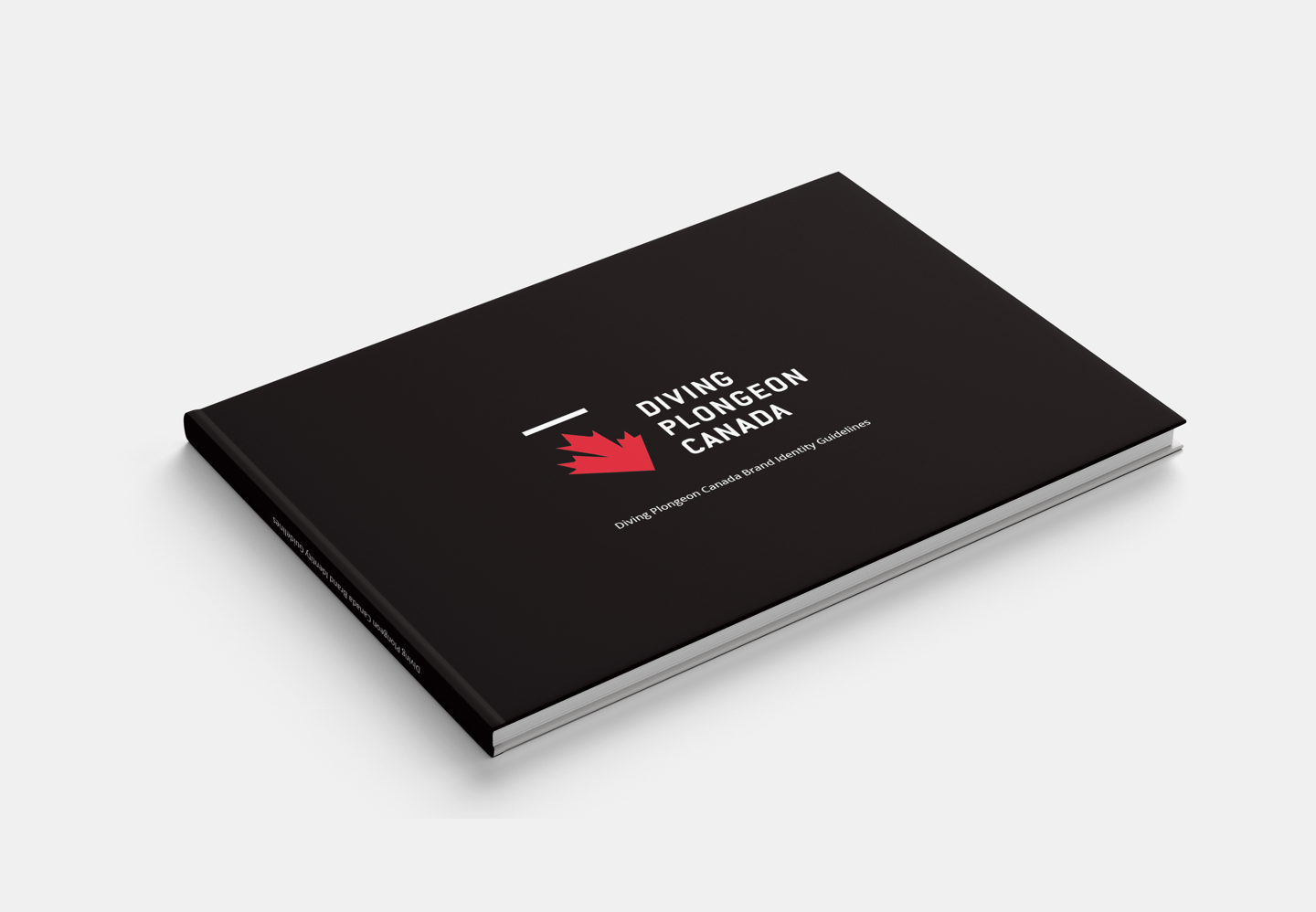
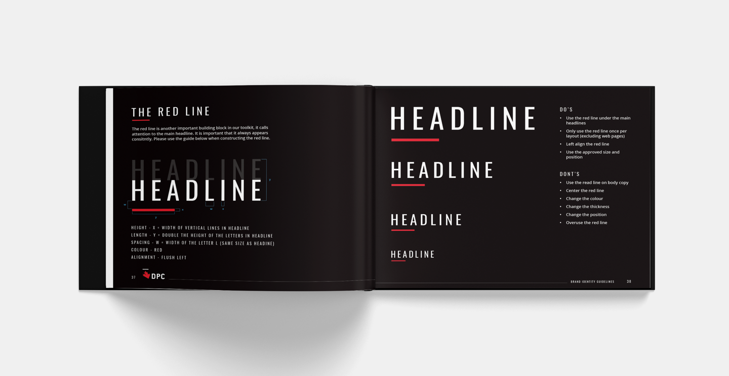
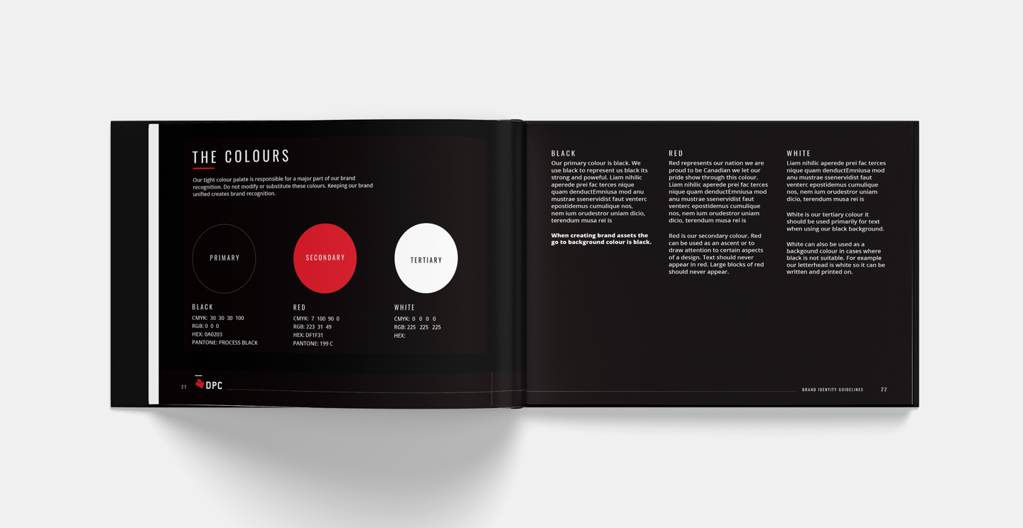
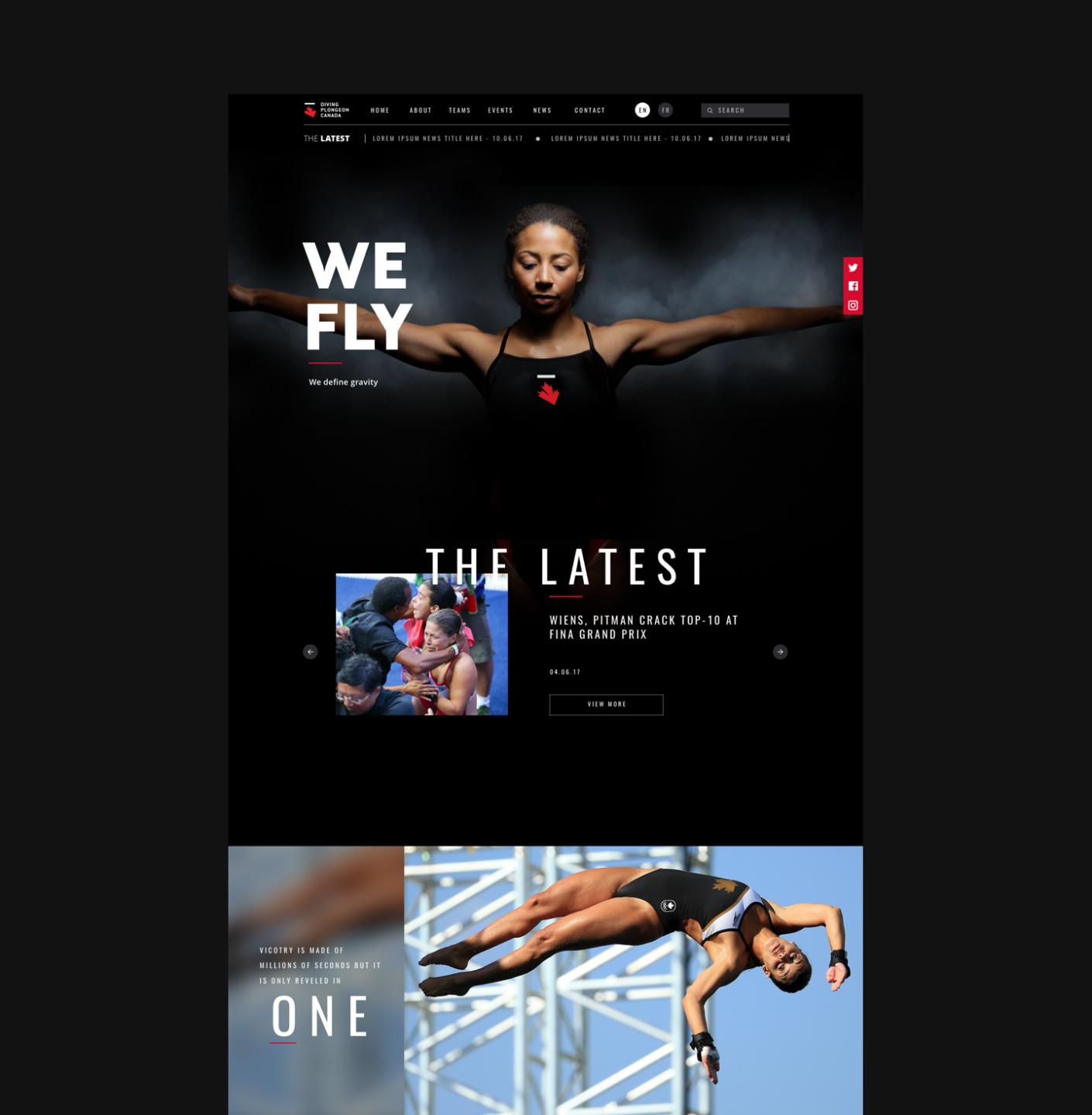
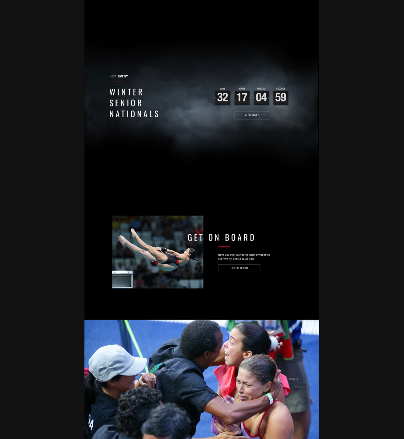
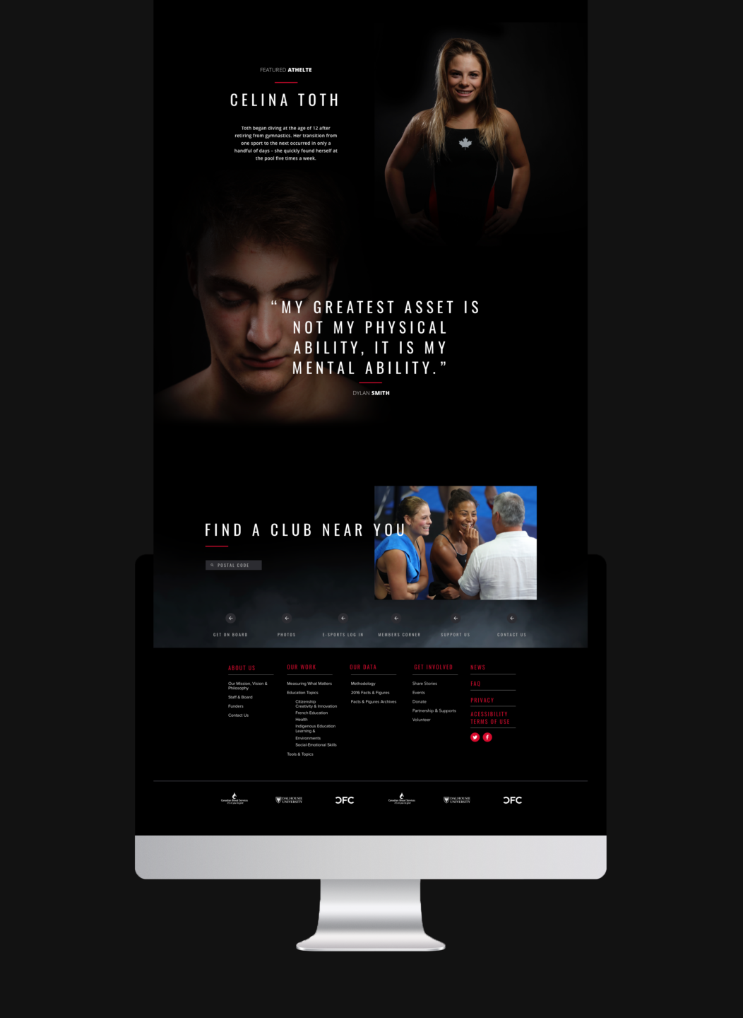
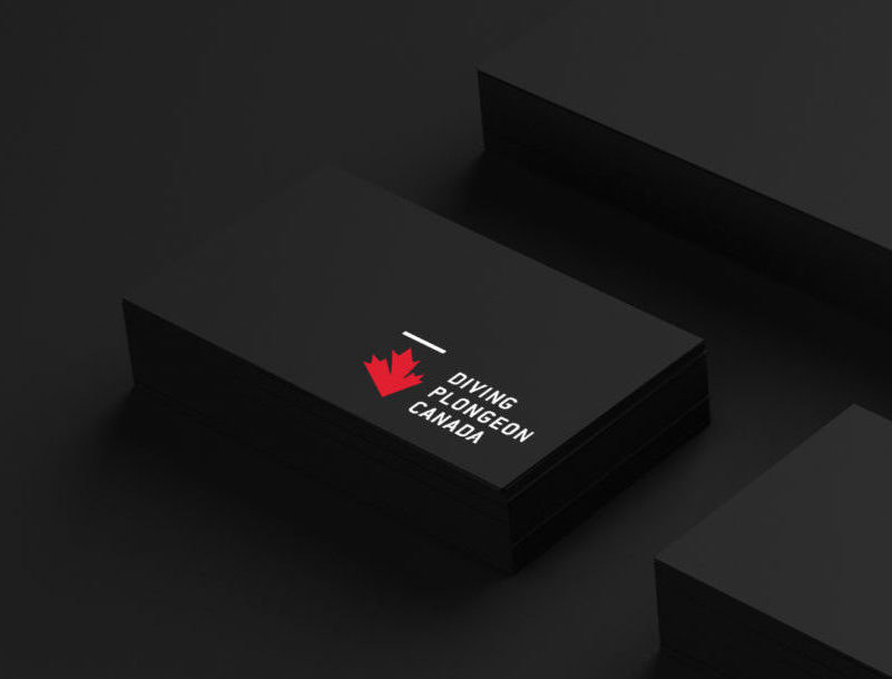
We wrangled their entire management team, locked them in a boardroom for two days and spent 10 weeks unearthing their brand’s ethos. Collaboratively we challenged the status quo, and pulled them into a state of clarity and confidence by developing the brand’s war cry “WE FLY”. The notion of flight is anchored on the brand’s big idea, “Defining Gravity”. Once these big ideas were established our team developed language, a complete visual identity system (from logo to social media design), a stunning website and a launch video (produced in partnership with our friends at K Collective) that will send chills up your spine. In partnership with our amazing friends at Diving Canada we have produced one of the most powerful Olympic sports identities on the planet…period. As they approach the road to the Olympics, the federation and our national team will dive into their destinies with more clarity, more confidence and more gold.
